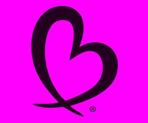
 When I first thought to create Bless Your Heart products as everyday reminders to bless, I knew what I didn’t want the logo to look like. I didn’t want it to be “churchy”, “crafty” or like it belonged in my Grandmother’s kitchen. No feathers, wings, gingham or lace. I didn’t want it to be preachy or heavy in its message and appearance.
I wanted the logo to fit into our everyday world and I wanted to have fun creating and talking about the power of Blessings. That’s a tall order. These were the guiding images: happy, uplifting, fresh, clean, random, simple, bright, modern, and radiating with good energy. I wanted the colors to be bright and contrasting, clean and trendy. It took many excellent designers and marketing people countless hours and brainstorming sessions until we got it right. My gratitude to Lee Calderon for bringing together all the previous concepts and ideas into the logo I love. Please visit Lee’s beautiful website: www.calderoncreative.com.
What was created is fun and beautiful. So take it wherever you want. Many will choose the introspective inspirational path and there is a place for that. Others will say “let’s just have a little fun and say “Bless You” whenever we can.”
I love the logo because I can and do incorporate it into my business surroundings, my ranch activities and the remainder of my personal life. Regardless of where I am or what I am doing, I know what the logo means to me when I see and feel it.


The logo is PERFECT! Excellent job to you and Lee.
Best of luck through the rest of the challenge!
-CW3
readysetyoubet.blogspot.com
Thank you. I’ll check out your site; sounds interesting.
Enjoyed your post. Look forward to reading your blog.
I’ll check yours out as well. Love your website url
That’s a beautiful logo. I think it captures what you wanted it to in a lovely image. (Visiting you from the A to Z Challenge.)
On my way to check out your blog. Thank you